
“KENT” paper experiment / KENT紙での実験
Honestly, I took up wax pastel (crayon) rather recently, and
have been giving my attention to how to use it. (You know,
commonly it is considered as a “kindergarten medium” and
“nothing professional”.)
I did not pay due attention to the “supports” of wax pastel paintings
— usually, paper!
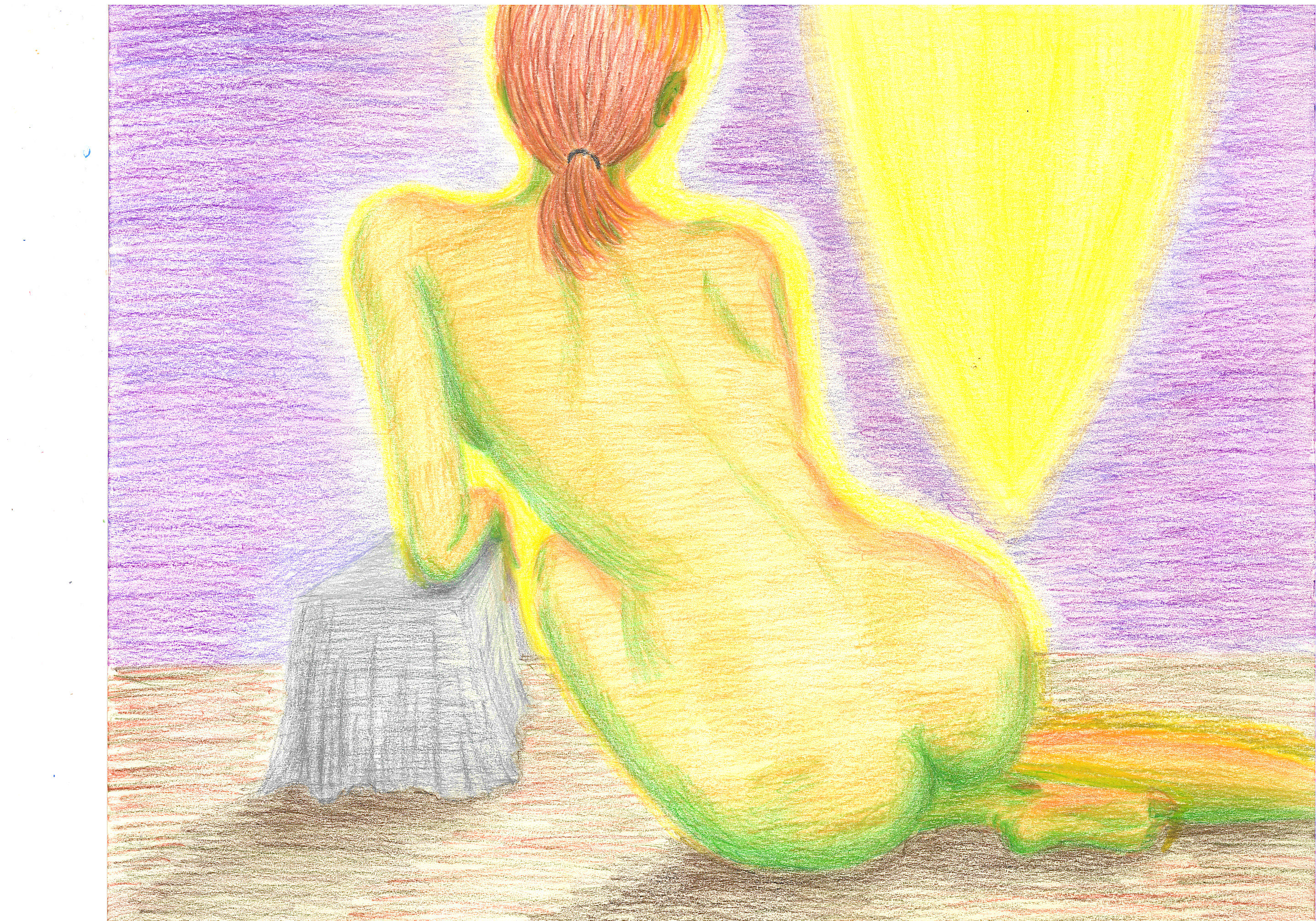
So, I experimented with a different paper, this time a brand named “KENT”,
which has a very smooth surface. I drew something similar to the
100-min exercise of Jan. 26 below.
The resulting difference is obvious, as you see in the image here.
A smoother surface results in more “cohesive” colors, while
a more coarse one invites more rough, uneven colors.
So, I’ll be more careful with the paper surface I use!
Experiment with a different paper surface
Wax pastel on “KENT” (very smooth) paper
Not for sale — just an experiment with paper surface characteristics
* To see my finished paintings (not experiments),
just click an item on the black menu above!
正直なところ、私がワックスパステル(クレヨン)という画材を使い始めたのは
比較的最近のことで、その使い方に関心がありました。(なにせ、
クレヨンというと「幼稚園の画材」と広く認識されていて、プロの画材とは
見なされていませんのでね)
そのため私は、クレヨン画の「支持体」つまり多くの場合には「紙」には、
これまで充分な注意を払ってきませんでした。
そこで、実験です。今回は、「KENT」というブランド名の紙を
使ってみました。表面がツルツルの紙ですね。下の1月26日のものと
似たような画面を描いてみました。
結果、違いは明らかですよね。ここの画像にある通りです。
滑らかな表面だと色の均一性・密着度が高くなりますし、デコボコのある
表面では色彩もムラが生じます。
今後は、使う紙の質にももっと注意することにします。
紙の表面の違いに関する実験
「KENT」紙(極めて滑らかな表面)にワックスパステル
非売品 ・・ 紙の表面の特性に関する実験です
* 私の作品(デッサンや実験などではなく、完成作)をご覧になるには、
上の黒いメニューでいずれかの項目をクリックなさってください。